A Deep Dive into Colour Theory 🍂🎨
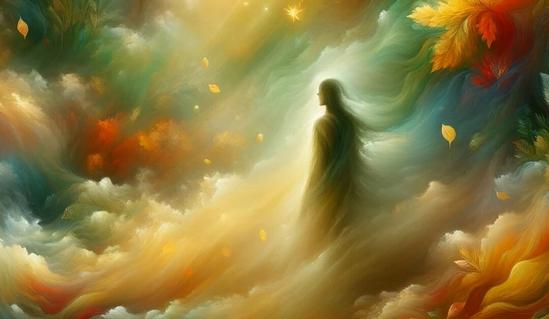
As the leaves turn and the air chills, autumn brings with it a palette that can warm any design. But how can we best use these Colours in our work? Let’s explore the science and emotion behind Colour theory. Autumn’s palette, from the fiery oranges to the deep, contemplative blues of the early night sky, offers a range of emotions to play with. Understanding the psychological effects of these Colours can transform your designs, making them not just visually appealing but emotionally resonant. Want to evoke a sense of comfort? Lean into earthy browns and deep reds. Looking for vibrancy? Bright oranges and yellows will do the trick. This post will guide you through selecting the perfect autumn palette for your projects, with tips on Colour combinations, contrast, and balance. Dive into the world of Colour with us, and let’s paint our designs with the shades of autumn.
#ColourTheory #AutumnHues #DesignInspiration #greenhousemedia


Recent Comments